Home › Forums › Weather & Weather Stations › crestline wx and cam?
- This topic has 23 replies, 4 voices, and was last updated 5 years, 3 months ago by
 John Benario.
-
AuthorPosts
-
April 11, 2020 at 11:32 AM #7861
 John Benario General Member
Any prospect for the Crestline wx and cam to be linked to the new website?
Also, my vote on the compass rose colors – I find the new graphics less clear than the older graphics. Perhaps go back to the deeper/darker colors of the old website.
April 11, 2020 at 11:37 AM #7862John Benario General MemberMy wife is a painter, she looked up color definitions. The new colors are of a “lighter tint” than the old colors. I vote for the “darker tint” of the old website.
April 11, 2020 at 11:38 AM #7863 David Webb General Member
Ken is working on getting into the Wx on Crestline and AJX – should be back anytime now (other post here).
We can work on the color palette for the compass, but I struggled with the old colors (found it super hard to read). I’m sure there are lots of differing opinions on this one, but we can try a few variations out to see which one works for the most people.
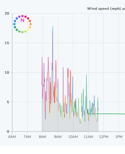
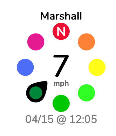
April 11, 2020 at 11:49 AM #7865John Benario General MemberIn staring at the current graph, the problem (to me) is that there is not enough difference between the colors. Right now at Marshall, see below, the northwest is not obviously different from the southwest. One needs to really stare at the graph to discern the different colors. The last blue going northwest is not obviously different from the last green going southeast. I.e. the blues and greens blend together.
 April 11, 2020 at 11:56 AM #7866John Benario General Member
Also, as a pilot, I am aware that in any large group of males, there will be some incidence of color blindness. (not being sexist, women tend to be afflicted with color blindness much less than males) Since CSS is probably large enough to be a good sample, there will be perception differences among the members. Perhaps some experimenting with different colors at different times would allow the members to provide their opinions.
April 11, 2020 at 12:56 PM #7867David Webb General MemberI completely agree with you. Full-disclosure: I am one of those people (deuteranopia, which is a red/green deficiency). For me, I find the new ones a lot easier to see the differences in the different directions, but obviously I can’t speak for everyone. In my opinion, I think the old graphs/compasses had too many “steps” in color (almost a full gradient all the way around) and I had to really stare at it to figure out what direction it was telling me.
Perhaps a run-through of the process for creating the new ones might help to see where I was going with them (maybe boring, maybe interesting – you be the judge)? Here goes nothing:
My primary concern was changing the color/direction as little as possible (trying to keep the pitchforks at bay) – both the old and the new had NE/Red, SE/Yellow, SW/Green, NW/Blue (and gradients in between those). If it were just me using it, I actually wouldn’t even bother with the color (maybe red for everything that has a north component, green for our ideal directions, and yellow for iffy/cross) as I think it would be much easier to read, but I know we all like high resolution in our weather readings. Even better (at least, to me), would be to include direction arrows along the graph lines so there’s absolutely no ambiguity about what direction it’s saying (that’s an issue because there would be way too many arrows packed in along those lines – would be impossible to read).
I decided to reduce the full-blown color gradient all the way around the compass down to 16 colors (1 for each primary/secondary compass direction). I thought the harder “steps” between directions would give greater clarity in reading the graphs (easier to tell which direction, since the colors would each be a bit more “different”). Sticking with the same theme as the old graphs (NE/Red, SW/Green, etc), I picked a bright red, blue, green, and yellow for the main directions (NE, SE, SW, NW) and then ran those colors through a tool to generate a gradient between each (that produced 3 “steps” between each main directional color). Same exact colors are used in the compasses and in the graphs (so that we’re using a consistent “language” everywhere on the site).
So the questions I’ve had in my head (maybe the same ones you’re considering now):
Do we just need to futz around with the color selections and make adjustments there (basically just picking slightly different colors to bump up the saturation/contrast)?
Are we going about it wrong and should we change it a bit more (perhaps going down to 8 compass directions / 8 colors; switching the primary colors/directions to N/E/S/W, so N is Red, S is green, etc and then generating the “steps” between those instead; switching to holfuy‘s model of green for good flyable direction, yellow for “good enough” and nothing/red for not flyable; or, something else entirely – maybe red for all of the north directions, and then blue/green/yellow for everything that has a south component)?
April 12, 2020 at 10:43 AM #7870John Benario General MemberYour process is good, but the 3 steps between dots at the tint level you have I do not think is adequately separating, and as you say you might not be the best judge with your red/green issue.
As an experiment, can you insert the old graphic next to the new one and take a vote? Is the HTML for the old one still available to you?
April 12, 2020 at 11:51 AM #7871David Webb General MemberThe old one is not an option – due to several reasons that I won’t go into, I was forced to recreate the graphs from scratch. It sounds like you’re just not sold on the colors currently being used – like I said, we can make adjustments to those. I’ll put together a couple of variations for everyone to take a look at.
April 13, 2020 at 9:45 AM #7874David Webb General MemberHere’s a variation (less “steps”; green is good, anything with red in it is bad).
 April 14, 2020 at 10:19 AM #7990
 Jerome Daoust General Member
I like it. Can we play Twister on it?
 April 14, 2020 at 11:33 AM #7991David Webb General Member
I sense a new variation on the fly-in bomb drops…
April 15, 2020 at 9:34 AM #7994David Webb General MemberOk – Twister variation with less colors is now up. Let’s try it out for a while and see how it goes. Also, this is another version of that with black direction marker (instead of the whole marker being the direction color). Chime in if you think one is easier to read than the other.
 April 16, 2020 at 10:12 AM #8015John Benario General Member
I like both versions. Much improved, also less data to download when at Crestline. Of the two I like the colored marker better than the black marker.
April 17, 2020 at 1:48 PM #8026John Benario General MemberA couple more items. The Crestline camera performance is very good, loads much better than before.
The 15 minute recap of the cameras is excellent, much better than before.
Are the temperature forecasts and actuals going to be added to the wind graphs like before?
April 17, 2020 at 1:53 PM #8027David Webb General MemberGreat! I actually haven’t touched the Crestline camera, so it’s possible something else is at play there (connection speed, computer, etc).
I had left off the temperatures from the graphs, since as I recall, only one of the weather stations was actually reporting temp data. Once CRS and AJX get updated to start sending their data again, I’ll take another look to see what we can get as far as temp goes.
For forecast temps, you can also click on the “View Details” link below the NOAA NWS forecast graphs on the right (underneath the windgrams). That will show you the full graph of all forecast data (temp, wind, etc).
-
AuthorPosts
- You must be logged in to reply to this topic.