Home › Forums › Weather & Weather Stations › New Weather Station Graphs
Tagged: graphs, weather data, weather station
- This topic has 8 replies, 5 voices, and was last updated 4 years, 10 months ago by
 David Webb.
-
AuthorPosts
-
March 4, 2021 at 12:08 PM #11515
 David Webb General Member
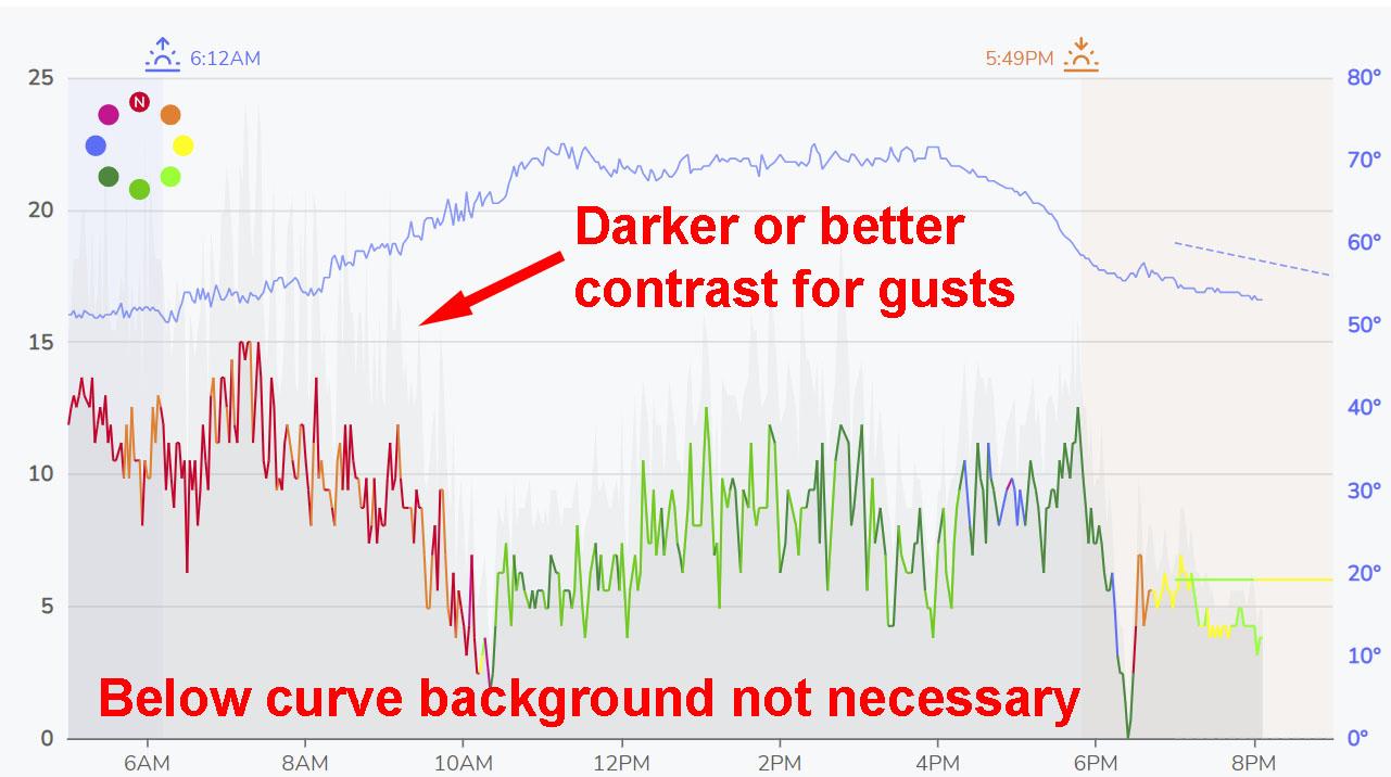
Been doing some experimentation with a new charting library, trying to improve upon the current weather station graphs.
The format is very similar to the current one, with a few additions:
- Sunrise and sunset are now shown on the graph
- Graph data is zoomable (for example, if you’re on your phone, you don’t have to zoom the whole screen – you can zoom the graph itself to see finer detail)
- Gusts are shown
- Popup balloons have been removed (I liked them, but agree with some that they get in the way if you are pinch zooming on a phone)
Feedback is appreciated. Still have a bit of testing to do with them, but if something jumps out as being crappy or annoying, or if you think they are an improvement on the current one, let me know.
March 4, 2021 at 6:24 PM #11520 John Benario General Member
Very readable. I like it.
March 4, 2021 at 8:05 PM #11521Sunrise/sunset and gusts are great additions. Aesthetically, not liking the bottom of the graph. Too dark. To my eye, the background should be consistent above and below the graph lines, the way it is with the temperature. The dark shade adds an extra element that doesn’t serve a function.
March 4, 2021 at 8:20 PM #11523David, congratulations on winning Website of the Year.
(Top of page 18 in the new magazine, for those who haven’t read about it.)March 5, 2021 at 8:19 AM #11529 David Webb General Member
That’s fair. Dark wind speed fill has been swapped out for something lighter, and a few other small adjustments have been made. Let me know what you think.
March 5, 2021 at 8:15 PM #11540Thank you David, definite improvements being made. My suggestions…
 March 5, 2021 at 8:49 PM #11541
 David Webb General Member
Copy that – will try out a few more adjustments early next week.
March 8, 2021 at 10:48 AM #11588 David Webb General Member
Made some adjustments, by request – no more fill on the wind speed/direction, darker gust line, etc.
March 15, 2021 at 9:36 AM #11669 David Webb General Member
New graphs are now live. I appreciate the feedback that I’ve gotten from some of you. Hopefully these are a step forward (I think so). Also – nothing is set in stone, so feel free to post any additional comments/requests here if you think something could be better.
-
AuthorPosts
- You must be logged in to reply to this topic.