Forum Replies Created
-
AuthorPosts
-
 David Webb General Member
Thanks Billie!
I don’t want to dig up an old argument, but we had no choice in doing away with the day use fee. We tried really hard to come up with a price for the month that would both be reasonable to visitors and to not harm the club financially. Glad you agree.
Cheers.
David Webb General MemberI’ve been peeking at the AJX webcam off and on today – looks like it’s been up. Sometimes you may have loaded the page up while the new image is still being created (especially goes for the animations, since they are larger and take a few seconds to process). If you notice an issue, first thing to try is wait a few seconds and reload the page.
Dan is the man as far as setting up Crestline cam presets.
David Webb General MemberThat’s awesome – by the time I thought to snap a pic, that closeup shot of him carrying the pole was gone.
David Webb General MemberThe loop will always only be about that long (for 15 minutes). Here’s the math:
- Assuming we have all of the last 15 minutes (sometimes the camera will not upload an image due to lots of reasons – power being the most common), we get 15 total frames.
- Animated GIFs have 100 “ticks” per second.
- To slow things down a bit, we set the delay on each frame (how long the frame is displayed for) to 20 ticks (roughly 1/5 of a second).
- If we have 15 frames, that equals 3 total seconds (plus a 1 second delay on the end) – 4 total seconds length.
Dan is the man as far as the Crestline webcam goes (I don’t know much about that one – we’re just linking to it from the site since it can’t be embedded). This doesn’t help you, but I’m on a Mac as well and I haven’t had any issues with viewing/using the Crestline webcam. It always says “your browser is not supported”, but ignore that and everything seems to work fine.
David Webb General MemberLight at the end of the tunnel: today, San Diego reopened / eased restrictions on many of the county parks.
Still not back to normal by any means, and definitely still a time for conservative flying (or staying home), but that’s a good sign.
David Webb General MemberInstead of scaling, Jerome had a good idea of just making 2 sizes available (standard and large). That’s done and up (you’ll now see 2 links below the webcam images). I also added a 1 second delay at the beginning of the loop so that it’s easy to spot the end/beginning of the looping.
David Webb General MemberI doubled the frame delay in the last-15 animations. It was set to 10 (these delays are measured in “ticks” – 100 ticks per second in an animated GIF); now set to 20. Let me know if you think that’s an improvement.
David Webb General MemberThe pop up goes as large as it can get and still display the image size at 100%, so in the case of the last-15 animation, it won’t fill your browser on most desktop sizes since the image is on the smaller side.
I can look into options on allowing scaling of the window.
David Webb General MemberI pulled the coordinates used for the NWS charts directly from the old site. If they need updating then I’m good with that. Post links that are to closer locations and I can update those.
I was thinking of adding in more delay between each frame (just to make that 15 minutes play a bit slower) – will put together a couple of experiments and post them to see what’s the least objectionable.
David Webb General MemberGreat! I actually haven’t touched the Crestline camera, so it’s possible something else is at play there (connection speed, computer, etc).
I had left off the temperatures from the graphs, since as I recall, only one of the weather stations was actually reporting temp data. Once CRS and AJX get updated to start sending their data again, I’ll take another look to see what we can get as far as temp goes.
For forecast temps, you can also click on the “View Details” link below the NOAA NWS forecast graphs on the right (underneath the windgrams). That will show you the full graph of all forecast data (temp, wind, etc).
David Webb General MemberThreaded replies are now off.
David Webb General MemberOk – baby steps:
- Main forum view has been updated – clicking on “Forums” anywhere on the site gets you to the main forum view, which now shows Topics sorted by last activity.
- Each topic in the list shows its title (clicking the title takes you to the topic itself), who started it (clicking the author name takes you to their profile), which forum it was posted in (clicking that takes you to the list of topics in that forum), and when the last post (reply) was (clicking that takes you directly to that last reply in the topic).
- On mobile sizes, this topic list is compressed a bit to accommodate the small screen – title (clicking that takes you to the topic itself), last post link is directly underneath (clicking that takes you to the last reply in that topic), and author.
- Paging buttons (previous / next) are at the bottom of the topic listing (if you’re super bored and just want to flip through all of the topics in chronological order of last activity).
- Removed “Active Topics” from the sidebar, as it was redundant with the main listing (that also means less scrolling on mobile sizes if you want to get directly to the recent replies or list of all forums).
There are a few cleanup items to do to turn off the threaded replies – that’s on the way.
David Webb General MemberCopy that!
Threaded replies (nested replies) can easily be turned on/off. Will test a few things out and turn that off, since that one’s been mentioned more than once (you and Jerome).
Referring back to the alternate view I added here, this one does the following already:
- Topics are sorted by the last reply (so the topic with the most recent reply is at the top, and topics that haven’t had a reply in a while are farther down).
- The “Last Post” column on the right in that list has a link directly to the last reply in that topic. This gives you access to the topic (for those who might be jumping in on a new topic) or directly to the last reply (if you want to go straight to that). This is how all of the other topic lists work as well (if you look in any forum, each topic has a “Last Post” column which takes you directly to the last reply in that topic).
- Topics (and forums) that contain content that you haven’t read yet (as long as you’re logged into the site) will show you the dark blue bar next to them to make them easy to spot.
It sounds like if we switch the main Forum list (what you get when you click on “Forums” in the main nav) to the new one (linked above) and disable threaded replies – does that (mostly) solve everything? We can always make more adjustments, but if doing those 2 things makes everyone’s browsing/posting/bantering process a lot easier, then those are easy to do.
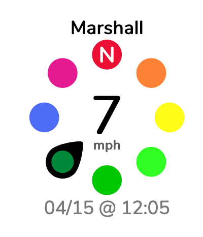
David Webb General MemberOk – Twister variation with less colors is now up. Let’s try it out for a while and see how it goes. Also, this is another version of that with black direction marker (instead of the whole marker being the direction color). Chime in if you think one is easier to read than the other.
 David Webb General Member
Based on the above, here’s one possible alternate view that we could use for the main Forums homepage (what you get when you click “Forums” in the main nav).
That’s essentially the “Active Topics” that you get in the sidebar (topic with the most recent reply is at the top, sorted by last topic reply); stickied topics are in yellow at the top.
Also, you’ve likely noticed that the sidebar has been updated as well – main forum listing got moved to the bottom to make the active topics and recent replies quicker to get to – and the extra search bar at the top of the forum listing has been removed.
Shout with thoughts on those.
-
AuthorPosts